设计面面观 (2009) 豆瓣 TMDB 维基数据 IMDb
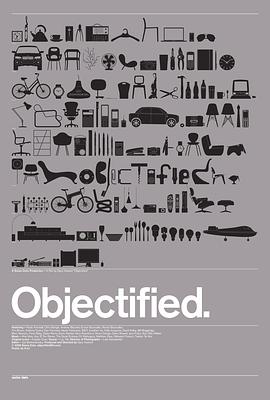
Objectified
其它标题:
Objectified
/
造物
…
由独立制片人导演Gary Hustwit执导拍摄的《设计面面观》是一部以工业设计为主题的长篇独立纪录片。影片详尽地展示了创造工业产品流程的实录片断,并记录了与世界顶尖设计师们的交谈与讨论。导演Gary Hustwit用洞察深切的镜头记录了这些在我们身边随处可见的工业设计产品,看似稀松平常的设计背后,却是设计师们倾尽全力的良苦用心。
《设计面面观》中采访到的设计师们包括:纽约现代艺术馆馆长Paola Antonelli,慕尼黑BMW首席设计师Chris Bangle,巴黎兄弟设计组合Ronan & Erwan Bouroullec,美国明尼阿波利斯市Walker艺术中心平面设计师Andrew Blauvelt等世界最具影响力的设计师。他们的设计正慢慢地改变着我们的生活,促使我们去思考得更多更多。
《设计面面观》中采访到的设计师们包括:纽约现代艺术馆馆长Paola Antonelli,慕尼黑BMW首席设计师Chris Bangle,巴黎兄弟设计组合Ronan & Erwan Bouroullec,美国明尼阿波利斯市Walker艺术中心平面设计师Andrew Blauvelt等世界最具影响力的设计师。他们的设计正慢慢地改变着我们的生活,促使我们去思考得更多更多。